Here are some plots
We often make plots in data science.
Here’s the tidyverse.
library(tidyverse)Here’s a dataframe.
plot_df =
  tibble(
    x = rnorm(100, mean = 1, sd = 2),
    y = 1 + 2 * x + rnorm(100)
  )
Here’s a plot. This seems to show
\[y_i = \beta_0 + \beta_1 x_i + \epsilon_i\]
plot_df |>
  ggplot(aes(x = x, y = y)) +
  geom_point()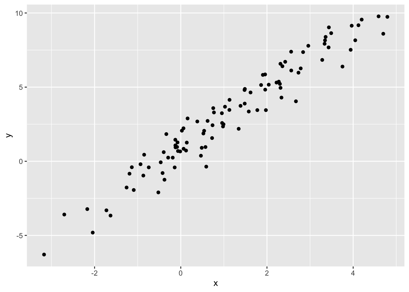
Go back to the homepage.